Typography Tips to Make Your Trade Show Graphics Stand Out
Learn how to use typography effectively to make your exhibition panels and shell scheme graphics stand out at trade shows with clear, engaging text design.

When it comes to making a memorable impression at trade shows, your exhibition panels and shell scheme graphics play a pivotal role. While eye-catching images and vibrant colours often steal the spotlight, typography is the silent powerhouse that can elevate your entire display. The right fonts and text arrangement can captivate your audience, communicate your message clearly, and reinforce your brand identity.
In this blog, well explore practical typography tips tailored for trade show graphics, ensuring your exhibition panels and shell scheme graphics stand out in a crowded event space. Whether youre a first-timer or a seasoned exhibitor, these insights will help you create impactful visuals that attract attention and convert visitors into customers.
Why Typography Matters in Trade Show Graphics
It influences readability, brand perception, and the overall professionalism of your display. At trade shows, where attendees often have just seconds to absorb your message, clarity is king.
Exhibition panels with poor typography can confuse or repel visitors, while well-designed text invites engagement and boosts recall. When paired with shell scheme graphics, typography completes the visual storytelling, balancing images and text to deliver a coherent narrative.
1. Prioritise Readability Above All
The foremost rule for trade show typography is readability. Yourexhibition panelsare often viewed from a distance, so your font choices and sizes need to be legible even at a glance.
- Font Size:Use a minimum of 24pt for body text and larger for headlines (typically 72pt or more), depending on the size of your panels. Headlines should be big enough to be read from several metres away.
- Font Style:Stick to clean, sans-serif fonts such as Helvetica, Arial, or Futura. These styles tend to be clearer and easier to read from a distance compared to ornate or script fonts.
- Contrast:Ensure high contrast between text and background colours. Using dark text on a light background, or light text on a dark background, provides the best readability. Steer clear of colours or gradients that clash and reduce clarity.
Remember, an exhibition panel is not a novel its a snapshot. The simpler and clearer your typography, the better your message will be received.
2. Maintain Brand Consistency with Fonts
Your exhibition panels and shell scheme graphics are extensions of your brand identity.
- Use your companys official fonts or those that complement your branding guidelines.
- Avoid mixing too many different fonts; two complementary typefaces are usually sufficient.
- Consider how your typography works alongside your logo and other graphical elements.
Maintaining brand consistency with typography across all your trade show materials gives your display a polished and professional appearance that attendees will remember.
3. Harness Hierarchy to Guide the Eye
Effective typography directs visitors attention and helps them process information quickly.
- Headlines:Bold and largest font size to grab attention.
- Subheadings:Smaller than headlines but still prominent to organise content.
- Body Text:The smallest size, used for detailed information.
Using different weights (bold, regular) and sizes to create this hierarchy improves scan-ability, which is crucial for exhibition panels where attendees spend only moments reading.
4. Keep Text Concise and Impactful
Less is often more on exhibition panels and shell scheme graphics. Limit the amount of text to essential information that sparks interest.
- Use short, punchy headlines and bullet points where appropriate.
- Avoid long paragraphs or complicated jargon.
- Focus on benefits, unique selling points, or calls to action.
Concise text works better with effective typography, allowing your audience to absorb the message quickly and encouraging them to engage further with your booth.
5. Align Text Strategically
Text alignment affects the readability and visual flow of your trade show graphics.
- Left alignmentis generally easiest to read and looks clean.
- Centre alignmentcan work for headings or short text blocks but should be used sparingly.
- Avoid right alignment for large blocks of text as it reduces readability.
Proper alignment keeps your exhibition panels looking organised and helps guide viewers through your information logically.
6. Use White Space Wisely
Dont cram your exhibition panels or shell scheme graphics with too much text or imagery. White space (empty space around elements) improves clarity and emphasises your typography.
- Ensure there is enough breathing room between headlines, subheadings, and body text.
- Margins should be generous to avoid a cluttered look.
- White space helps important text stand out and keeps your design balanced.
7. Test Typography in Context
Before finalising your exhibition panels and shell scheme graphics, test your typography in real-life conditions.
- Print samples and view them from a distance similar to what trade show visitors will experience.
- Check how your fonts appear under different lighting conditions.
- Get feedback from colleagues or friends on readability and overall appeal.
Testing helps catch issues early and ensures your typography performs well when it matters most.
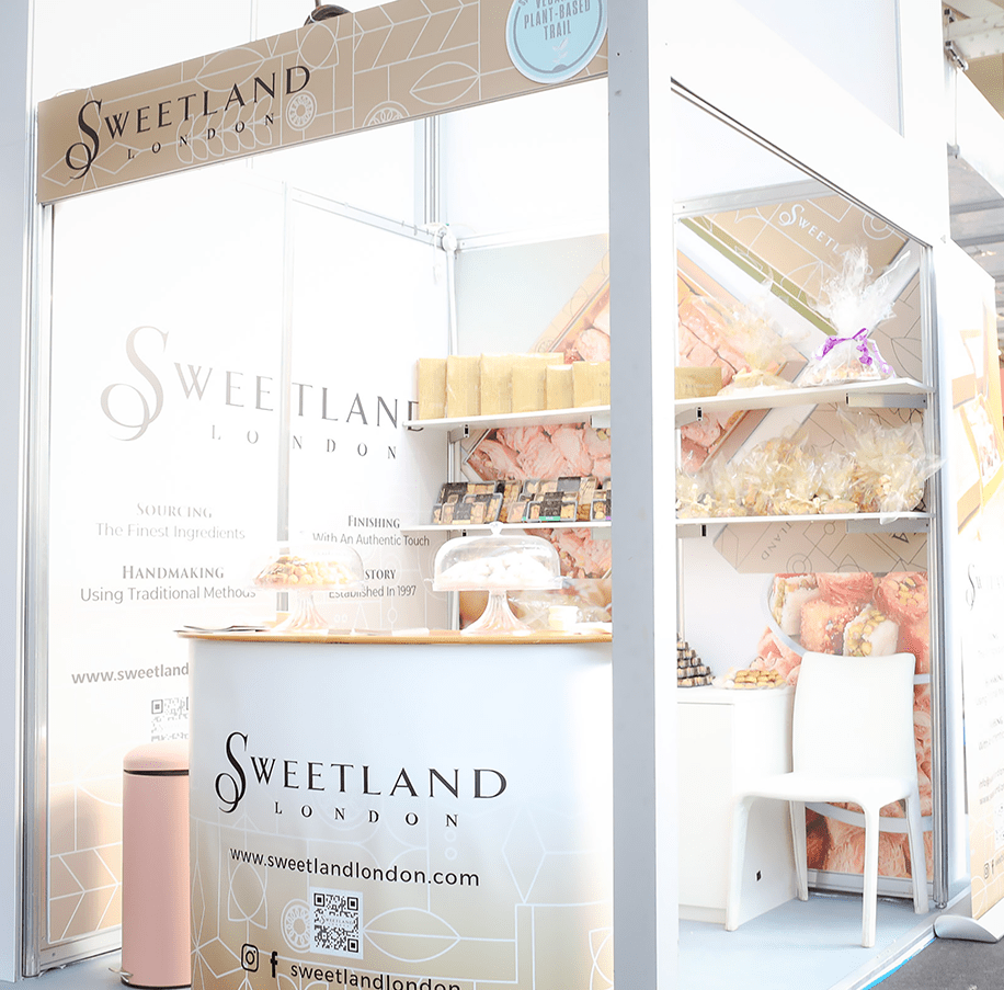
8. Incorporate Typography Trends Carefully
While timeless typography principles matter, incorporating subtle trends can modernise your trade show graphics.
- Consider using bold, oversized fonts to create impact.
- Use contrasting font pairs to add visual interest.
However, always prioritise readability and brand alignment over fleeting trends.
9. Ensure Digital and Print Consistency
If youre using digital displays alongside physical exhibition panels, maintain consistent typography across both mediums.
- Use the same fonts and hierarchy.
- Ensure colours and contrast are matched closely.
Consistency across print and digital touchpoints strengthens brand coherence and reinforces your messaging.
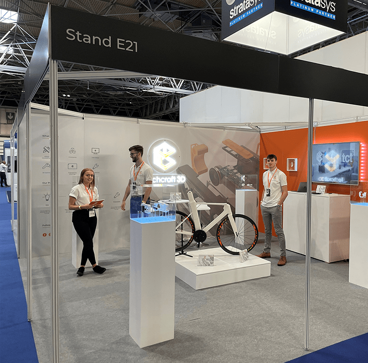
10. Optimise Typography for Shell Scheme Graphics
Shell scheme graphicsare modular displays often made of multiple panels. Typography on these needs extra attention.
- Avoid placing important text near panel edges or seams to prevent distortion.
- Use larger font sizes to compensate for potential viewing distance variations.
- Design with continuity in mind, ensuring typography flows smoothly across panels.
Planning your typography with shell scheme graphics unique characteristics in mind will maximise impact and readability.
Final Thoughts
Typography is a powerful yet often underestimated element of trade show graphics. When applied thoughtfully, it can transform your exhibition panels and shell scheme graphics into compelling communication tools that capture attention and convey your brand story clearly.
Remember to prioritise readability, maintain brand consistency, use hierarchy strategically, and embrace white space. Test your designs in real settings and keep typography aligned across all your trade show materials. With these tips, your next trade show display will stand out from the crowd and leave a lasting impression.
If youre looking for expert printing solutions to bring your typography to life on exhibition panels and shell scheme graphics, consider partnering with the Board Printing Company. They combine quality craftsmanship with attention to detail, ensuring your trade show visuals make the impact you desire.


